Introduction: This assignment practiced and proves my ability to differentiate between levels of measurement, differentiate between classification methods, retrieve data from the U.S. Census, join data, and build cartographically pleasing maps.
Part 1: There are four main types of data relevant to mapping. These as nominal, ordinal, interval, and ratio data. Nominal data
is data classified by name. Examples of nominal data are gender, land cover,
dominant species, etc. In each of these examples are two or more categories
each with a different name. Figure 1
shows two categories: more women, and more men. This map shows nominal data. Ordinal
data is characterized by showing the rank or order each unit of data falls into.
Figure 2 shows ordinal data because
it shows the rankings of the 10 busiest air travel routes. Interval data
describes a numerical value associated with each unit of data however 0 does
not really represent anything in this type of data. The best example of this is
a temperature map, as 0 does not represent 0 energy or absolute 0 in the most
commonly used temperature scales. In other words, the temperature value is not
a magnitude of temperature. Figure 3 shows interval data, and is a
good example with negative values being displayed. Finally, ratio data is
numerical data with a 0 that means something. The Richter scale is a good example
of this with a 0 meaning no earthquake, therefore Figure 4 is a good example of a map showing ratio data. When
looking at this map take into consideration that it is a bivariate map and that
the size of the bubble is what shows the magnitude, the ratio data.
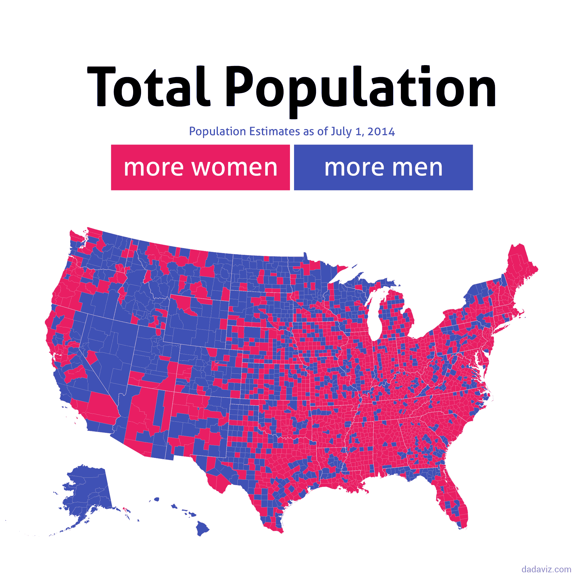 |
Figure 1
https://images.washingtonpost.com/?url=https://img.washingtonpost.com/blogs/wonkblog/files/2015/07/Gender.gif&op=noop
|
 |
Figure 2
https://twistedsifter.files.wordpress.com/2013/08/top-10-busiest-air-travel-routes-of-2012.jpg?w=800&h=410 |
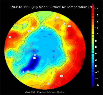 |
Figure 3
https://upload.wikimedia.org/wikipedia/commons/thumb/3/3c/JulArcticSfcT.svg/350px-JulArcticSfcT.svg.png |
 |
Figure 4
http://d3svfn6as6o5bl.cloudfront.net/mpt/howto/case_eq_world_eck4.png
|
Part 2: In a hypothetical situation in which I am working for an agriculture consulting and marketing company trying to find customers and persuade them that there needs to be more female farm operators I was able to make three maps using three different classification techniques that are shown below (Figures 5-7). It is evident from these maps that efforts should be concentrated on the farms in the northern and central areas of the state.
Figure 5 shows the equal interval classification method map. Each interval corresponding to a separate class has the same breadth in this scheme. Figure 6 shows the quantile classification method map. This method has an equal number of data points in each class. Figure 7 shows the natural breaks method. This method finds the larges gaps in data and designates class extents based on these. After making these three maps it is clear that the quantile method produces the map that would best persuade business owners to instill females into higher ranks. This is because if one focuses on the northern most areas in Wisconsin there are then the largest differences between these areas and the other area, creating a sense of being abnormal.
 |
| Figure 5 |
 |
| Figure 6 |
 |
| Figure 7 |


No comments:
Post a Comment